How Claude Cowork Turned a Renewal Notice Into a Brand, a Website, and a Mailing List.
A few weeks ago I wrote about setting up Claude Cowork as a daily productivity system — morning briefings, calendar scanning, email flagging, news digests. A lot of people asked me to report back on how it was going.
Short version: it’s working. Longer version: It’s helping me take action on things I need to do to drive my business.
The setup
Every morning before I sit down at my desk, Claude has already scanned my work and personal inboxes, checked my calendars, pulled AI and healthcare news from a half dozen sources, and assembled it into a single brief. The brief is waiting for me when I open my laptop. It tells me what needs attention today, what’s coming this week, and what’s happening in the industry that I might want to write about (it also suggests LinkedIn post topics and drafts, but that’s a separate story).
The first few days required some technical tinkering — not plug-and-play yet if you’re non-technical. But once I got it dialed in, the value wasn’t the brief itself. It was the safety net. School permission slips I would have missed. Calendar conflicts I hadn’t noticed. It’s like having an executive assistant who reads everything before you do and says “hey, you should know about this.” And then, one morning, it flagged an innocuous renewal notice.
The $359 email
A year ago I needed a website. Not a great website. Just a website. I grabbed a WordPress plan at $59/year and threw together a basic page. Branding? Later. Design? Later. I had clients to land.
The renewal came in a few weeks ago at $359.
Claude flagged it in my morning brief. I told Claude it seemed steep for what was basically a digital business card. Claude pulled up my site, looked at it, and agreed — there was no way this was worth $359/year. Then it said something I didn’t expect:
“You know, you don’t need WordPress for this. I could build you a static site on Netlify. Hosting would be essentially free.”
I was intrigued. But every time I’d thought about redoing my website, the same thing stopped me: I still had no branding. No logo. No color palette. No fonts chosen. Nothing. If you’ve ever tried to design a website without a brand system, it’s like trying to furnish a house before you’ve picked the paint colors. Everything looks wrong.
The branding detour
Here’s the thing about branding when you’re starting a business: if your first instinct is to spend weeks perfecting your logo before you have paying clients, you’re probably not going to make it. So I did the rational thing and ignored branding entirely for a year. Which meant I now had a year-old business with no visual identity whatsoever.
I told Claude my concern and it basically said, “Let’s just do that too.”
It started off shaky, honestly. The first few logo concepts were generic — the kind of thing you’d get from a logo generator. But then I mentioned that “Vettaris” comes from the Italian word vetta, meaning “peak” or “summit”. Claude immediately latched onto the mountain metaphor and the iterations got better fast.
What was wild was the process. Claude independently built me interactive web pages where I could mix and match color combinations, icon variations, and font pairings side by side. It wasn’t showing me mockups and asking me to imagine. It was giving me working prototypes to react to. I’d say “the navy is too dark” or “I like that font but not with that icon” and it would regenerate the whole page with adjustments.
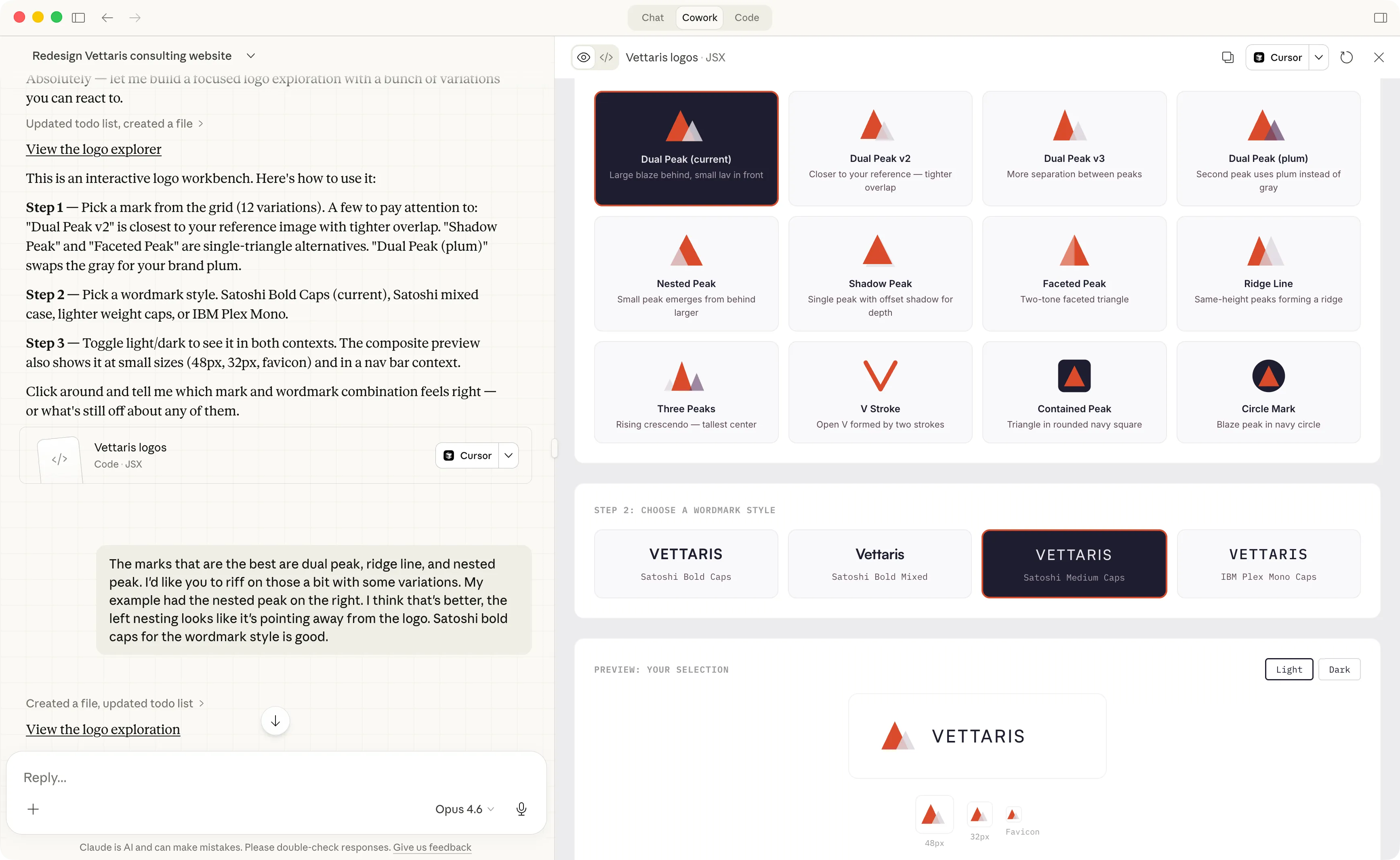 The interactive logo workbench Claude built — pick a mark, pick a wordmark style, see it in context.
The visual direction exploration worked the same way. Claude generated complete style tiles — colors, typography, layout feel — as clickable tabs I could compare side by side.
After maybe a dozen rounds we landed on a brand system: a Rising Ridge mark (two overlapping mountain peaks), a navy-plum-blaze color palette, and Satoshi/Inter typography. It isn’t going to win design awards. But it looks good, and more importantly, it isn’t just a template with my name swapped in.
Claude also produced business card designs using the new brand. I refined the layout, sent them to a printer, and walked into a networking event last week with cards that matched a brand that hadn’t existed days before. A small milestone for a business where my focus had been entirely on client outcomes, not my own presentation.
The website
With the brand system in place, we went back to the website. Claude built it using Astro — a static site framework I’d never heard of. To use WordPress effectively, you have to actually learn WordPress. Astro is entirely command-line driven, which is actually easier — not for me, but for Claude. Claude loves command-line tools. I describe what I want, Claude makes it happen. The activation energy dropped to basically zero.
We went through several design iterations, trying different layouts and copy approaches. I’d look at a version, say what I liked and didn’t, and Claude would rebuild it. Same process as the branding: working prototypes, not mockups. What’s great is that I can change this any time I want by just having a conversation with Claude. In fact I made several changes while I was drafting this post as I realized I wanted some new capabilities (like the ability to click on the screen shots and see them at a larger size).
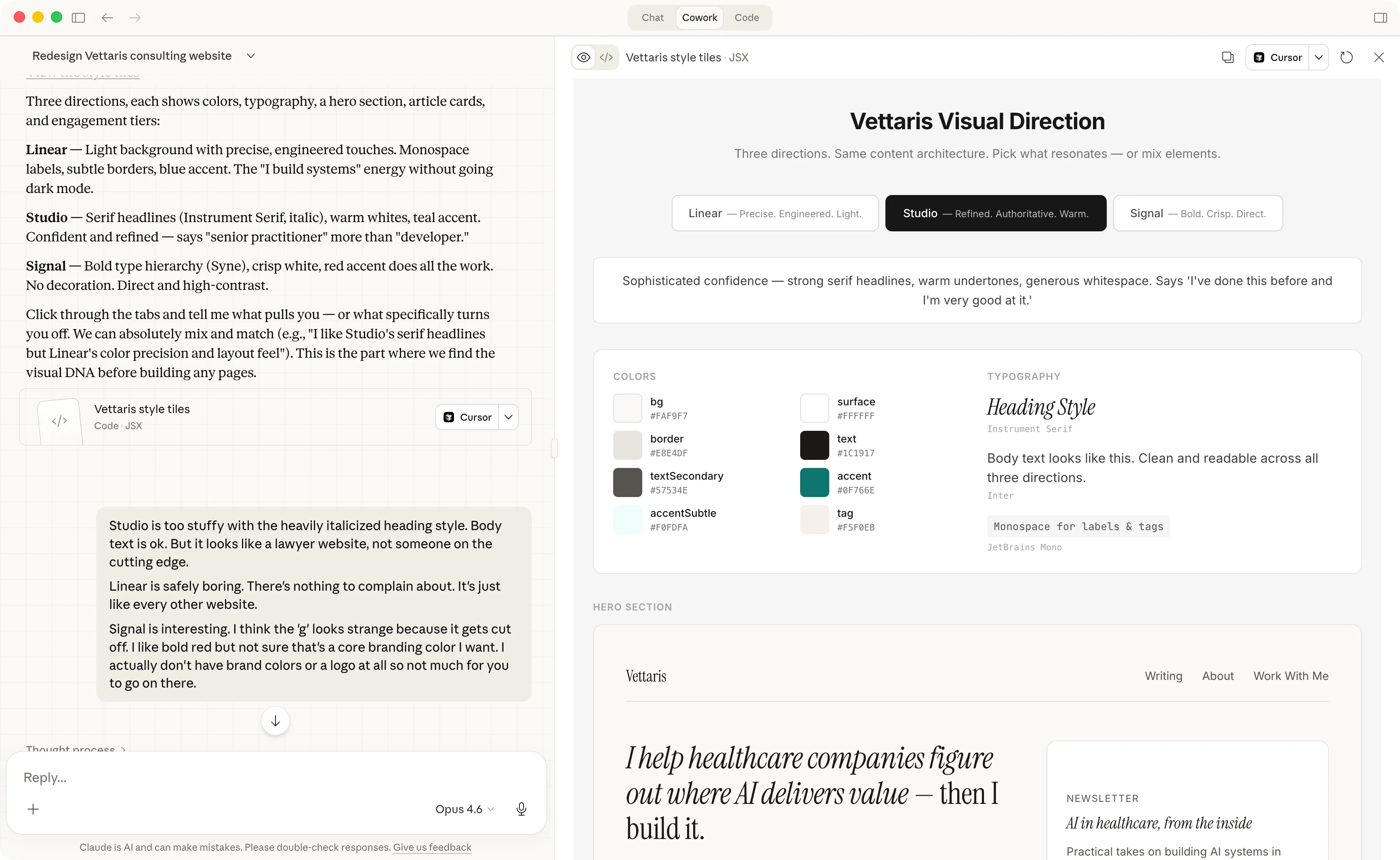 Three visual directions to react to, not describe. “Studio” won — but I borrowed the typography from “Signal.”
The result is the site you’re reading this on. It deployed to Netlify in minutes. Annual cost: $0 (or close to it, depending on traffic). That’s a $359/year savings on day one, but the real value is that I actually like my website now instead of seeing it as an item on an infinite business to-do list.
The writing section (and why you’re reading this here)
I’ve felt constrained by LinkedIn for a while. The format is great for punchy takes, but the lack of text formatting and the length limits make it hard to develop an idea fully. I’ve been thinking about standing up a Substack for months but kept putting it off because — like the branding — it felt like a project that would take time I didn’t have.
Claude Cowork set up a writing section on the site, pulled my LinkedIn analytics, and selected some of my better-performing posts to feature here to start. Now I have a place for longer pieces, proper formatting, and the ability to actually structure an argument across more than 3,000 characters.
So if you’ve enjoyed what I’ve been sharing and want to be sure you don’t miss anything — practitioner-level takes on healthcare and life science AI, plus a curated digest of what’s actually worth paying attention to — sign up below. My goal is to make each email worth opening.
The meta observation
None of this was planned. I didn’t sit down and say “I’m going to rebrand my business, rebuild my website, and launch a mailing list this month.” A $359 email showed up in my morning brief and I was able to react in a way I otherwise wouldn’t have because of the AI systems I’m putting in place.
A year into this business, I finally have a brand, a real website, and a place to write. Total cost: my $200/month Claude Max subscription and about a week of back-and-forth conversations squeezed in between client work. It would be an incredible deal at twice the price.